How do you make
the most of two
minutes?
We built an app for that.
When you’re a salesperson, you’ve got roughly two minutes before a foot in the door becomes a door in the face. So, when Comcast asked us to help modernize their sales tools away from paper brochures and door hangers, we got to thinking about how to give their pitch an upgrade.
A wonderful example of how a brand promise, in this case ‘Simple. Easy. Awesome.’ can flex beyond advertising and reinvent the sales experience.

Monica Lorusso
EVP, Strategy

Simpler. Easier. Definitely More Awesome.
As one of the largest internet and digital cable providers in the country, Xfinity’s entire identity revolves around cutting-edge tech for the modern home. So, we made a sales app to reflect their forward-thinking brand. And we did it from scratch.
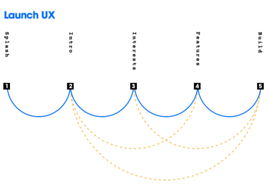
We mapped the customer and salesperson journey and reimagined it to be more intuitive and conversational. Then, we torture-tested it. Over and over again until we made, broke, and re-built at least five prototypes. So what started as scribbles on an office whiteboard, in the end, turned into a better way for every Comcast salesperson to engage with potential customers.
The process was incredibly iterative and research driven, informed by user testing all along the way.

Abby Zug
Senior Experience Designer